Swedbank

I was part of an ambitious project to redesign an award-winning app from scratch for one of the largest banks in Baltics, Swedbank. The beta app was successfully launched in September 2018, aiming to replace the old app in 2019.

Being a part of a cross-functional team, my responsibilities included creating a visual design system, UX research, wireframing, user testing, concept development, and UI design. UI design-wise, I was responsible for iOS.

Title

Product Designer

Time

Jul 2017 - Jan 2019

Platform

iOS

Background & Problem

Swedbank Baltics has 1.2 million unique users monthly in Estonia, Latvia, and Lithuania (~6 million population total). The old (hybrid) app was built with little UX research involved and struggled to scale alongside the ambitions to bring the best experience to mobile.

Old Swedbank Baltics app

How might a new app bring enjoyable experience for both transitioning and existing users and attract a new audience?

Solution

The goal was to build a native (iOS and Android) product, keeping core functions and features of the old app. We also “tunneled” user experience, so users could focus on a single manageable step at a time.

Final designs

MVP app - Design Process

The team had followed an iterative design process from the outset of the project. By the time I joined, the MVP part of the project had already gone through the following stages:

Wireframes and QOC analysis

We had a brainstorming session inside the team to generate as many layout ideas as possible. As a result, we had over 30 rough sketches after an hour session, which we grouped into 3 layout types (cell, list, and cards) and generalized ideas with the majority of votes into 8 main concepts.

First wireframes

Have “Why” behind every desision

After a brainstorming session, we tried to decide which concept to choose and ended up building QOC tree graph to make all options & reasoning more illustrative. We also conducted a quick Guerrilla testing on paper prototypes to double check if our decisions coincide with users perception.

QOC analysis helped to collect design options & criteria in one place and quantitatively evaluate trade-offs between several design options.

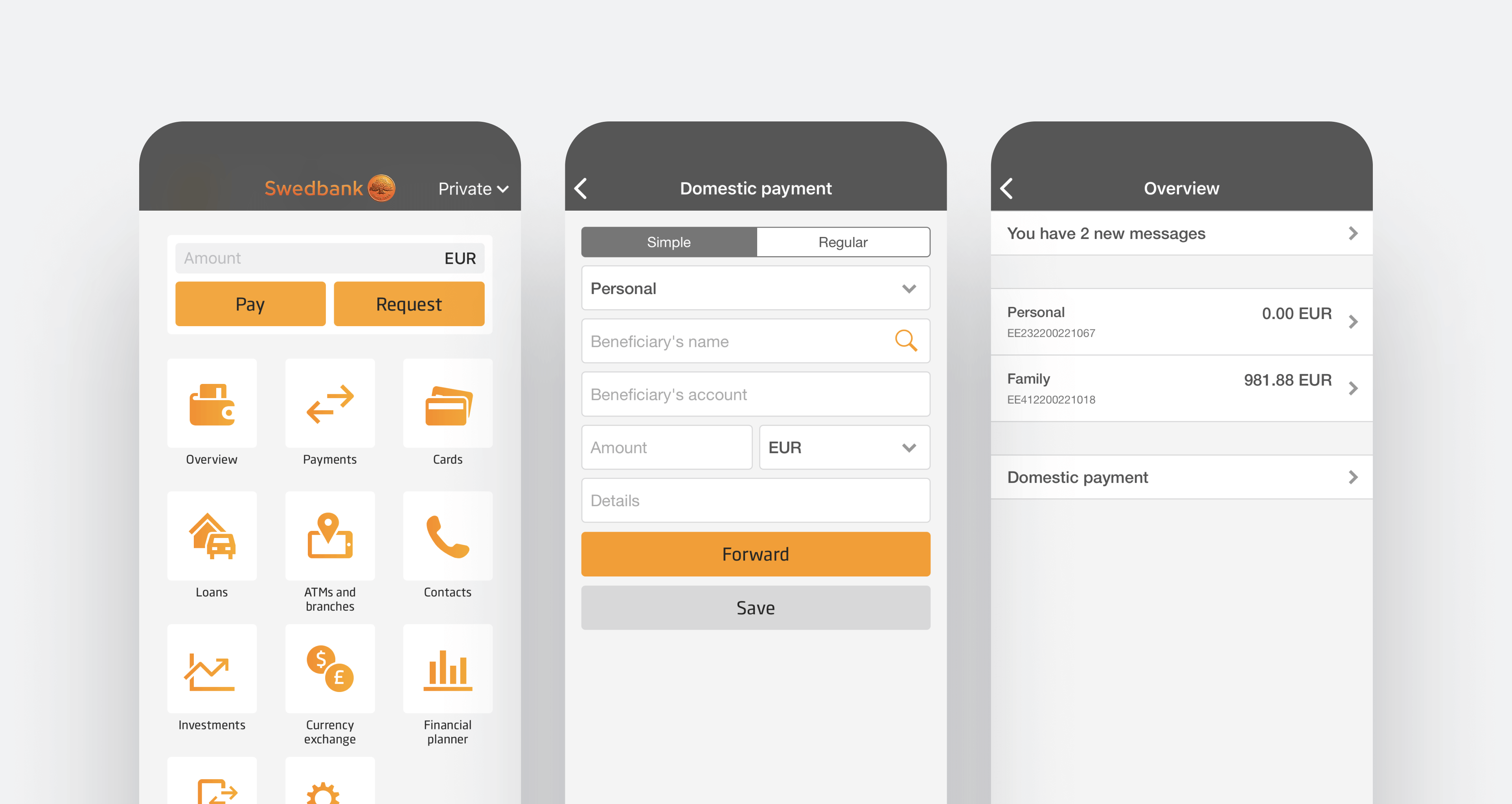
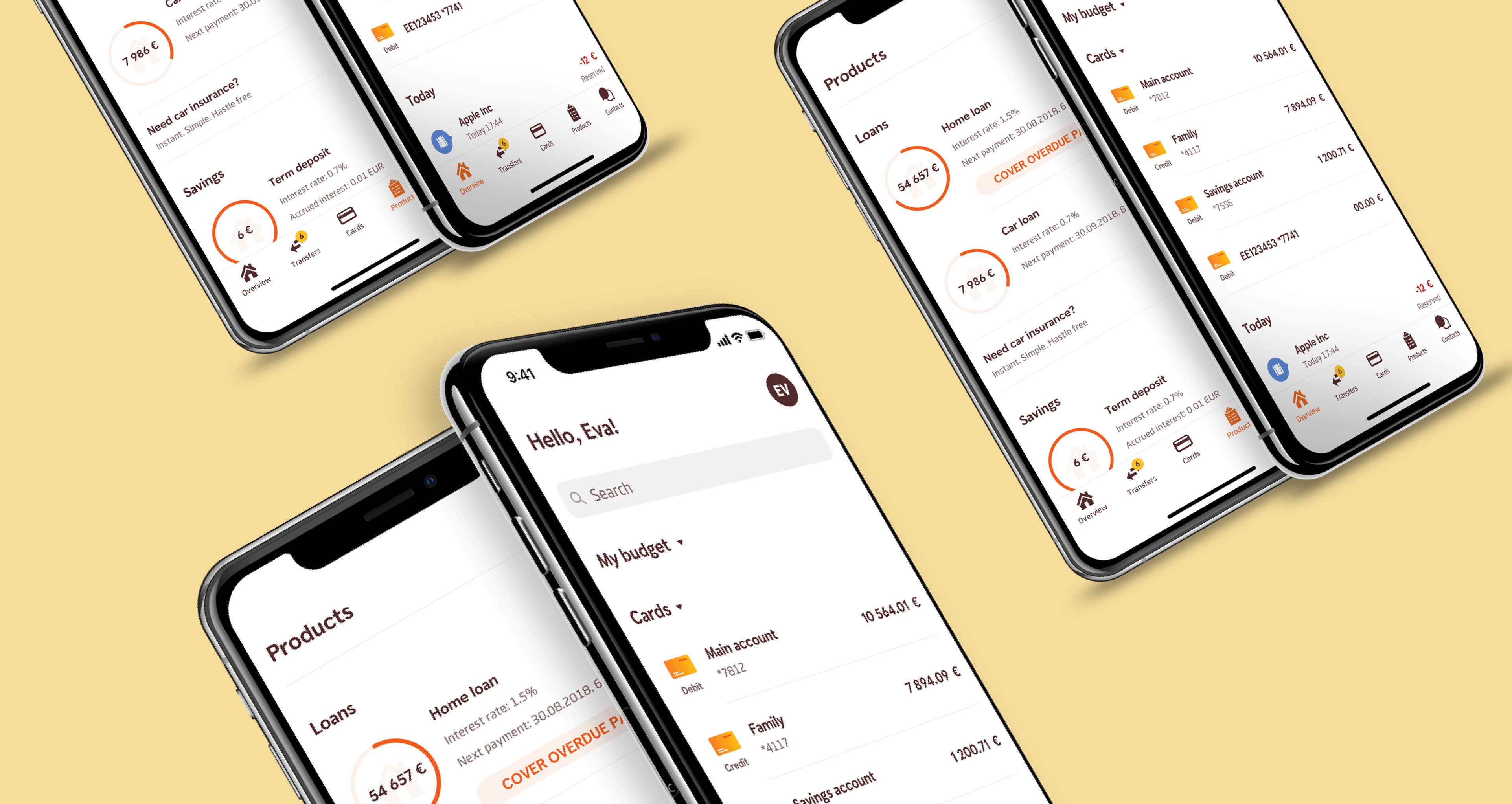
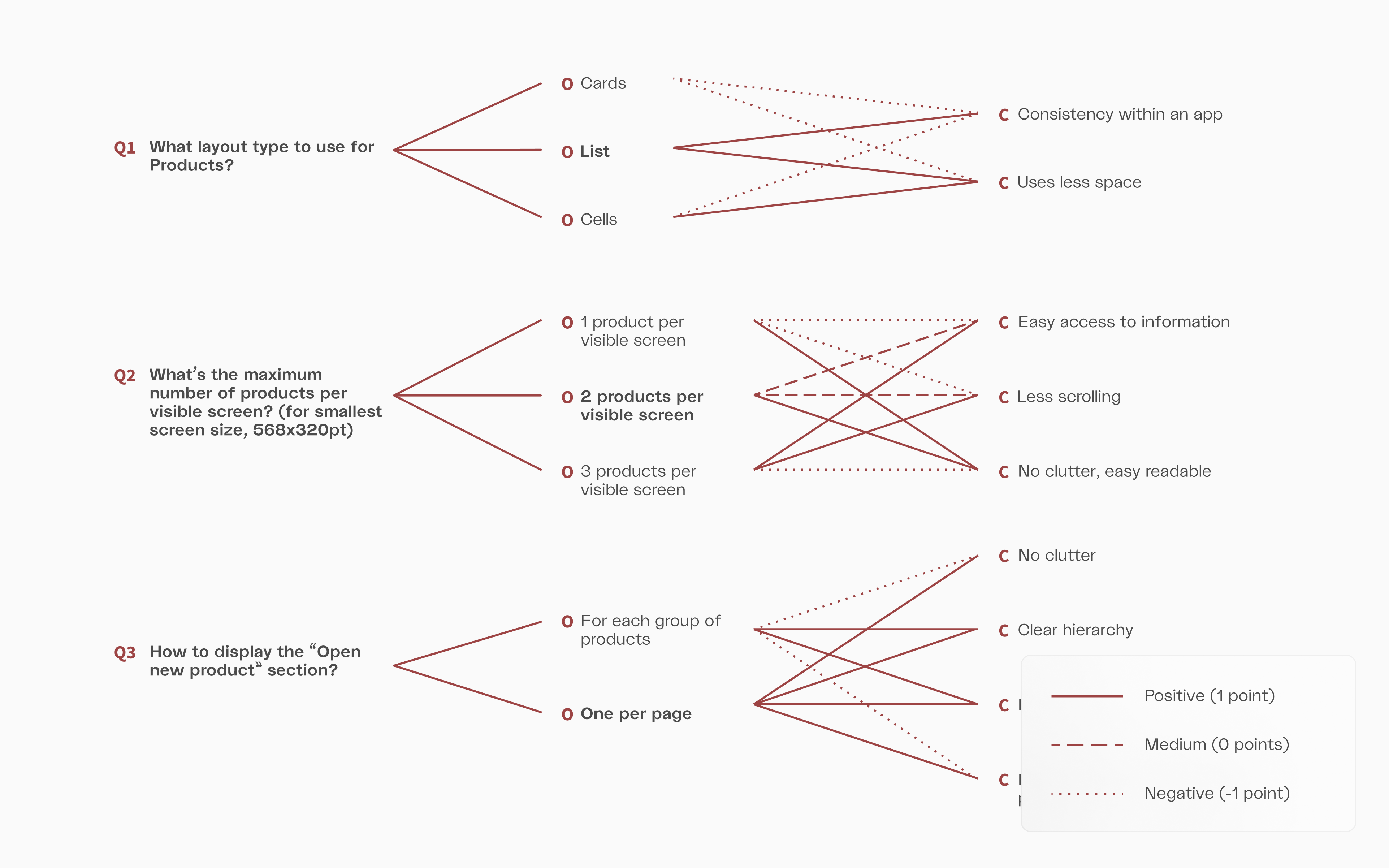
Iterate, iterate, iterate

When first prototypes were done, we focused on testing of an MVP app to incorporate user feedbacks early. We tested and refined design iteratively. The changes that came after the first rounds of iteration were mainly not in the app structure but in details.

Design changes for better

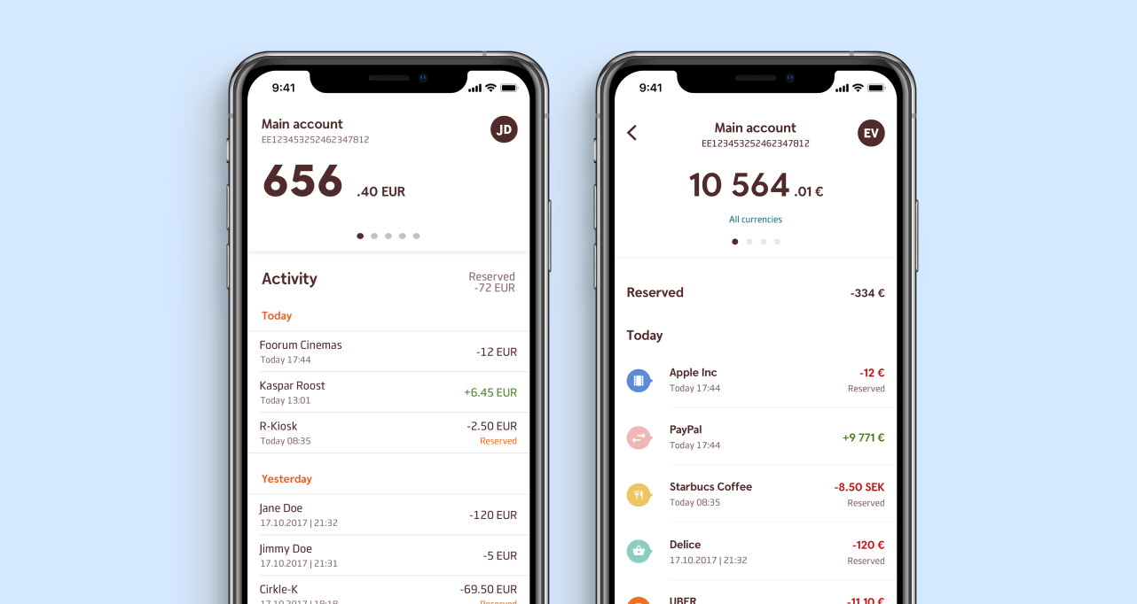
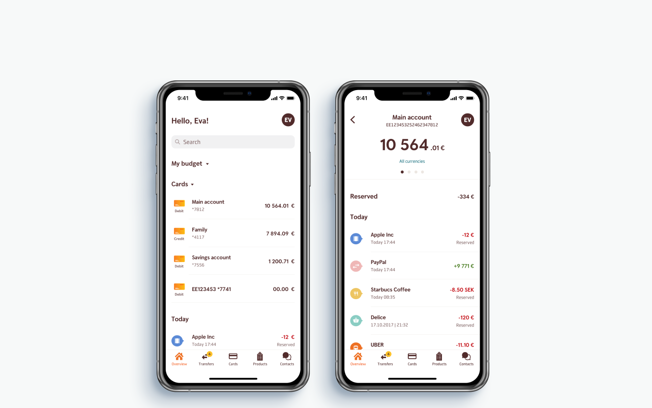
Banking app is information dense even at an MVP stage. When new features are added, it would get only worse. So we created a stronger visual hierarchy between headers and subheaders, main and secondary text to help users orient in the layout.

We made it through:

  • Typography (larger & bold headers, bold main text versus regular secondary text);
  • Increased negative space (less clutter);
  • Layout (established a deeper two-layer visual hierarchy between by adding category icons);
  • Colour (color-coded transaction categories and highlighted negative and positive values in red or green).
  • MVP (on the left) and later designs (right)

    Summary view

    During a dogfooding stage we got feedbacks that users were not happy with an account balance popping up on the screen with a large font size right after log in. They felt like it could potentially infringe on their privacy.

    So we created a summary screen (which was in a pipeline, but not a part of MVP) and also reduced font size on a detailed screen.cy.

    New summary screen (on the left) and detailed view (right)

    Visual Design System

    The end result was a component library so that designers had reusable building blocks and developers could easily get characteristics of all elements.

    I was solely responsible for creating a mobile design system.

    Elements of the design system

    Takeaways

  • Advocate for the best user experience above all.
  • Provide solid foundations for all design decisions.
  • Effective and efficient communication between different teams as important as inside one cross-functional team.
  • Design in the context of an existing product
  • The Beta app feedback

    The beta app was successfully launched in September 2018 on both platforms. The new and the old apps are accessible at the moment and will coexist until feature parity is reached. We have got a lot of positive feedback from our customers about the beta app (as well as some constructive feedback which was incorporated into future design iterations).

  • “It‘s convenient and easy to use. I‘m waiting for a full app version"
  • „The MENU is much more intuitive and faster than before.“
  • “Design is unreal! Very fresh and modern. It works perfectly! Super App!”
  • “It‘s very convenient split to Today and Yesterday in the overview.“
  • “Very good and cool app, I‘m happy I chose a smart bank.“
  • This doesn't have to
    end yet, you know!

    Email me at
    and let's talk about anything

    See more work

    Designing an app to help 20+ million practice wellbeing daily

    Creating an alaytics tool to scale chatbot to 100,000 customers