Insight Timer

Insight Timer is a meditation platform with 700k daily users.

Title

Design System Lead

Platform

iOS, Android, Web, Smart TV

Time

Dec 2019–Present

insight-timer

What is Insight Timer?

Insight Timer is a meditation app built with a focus on community and connection. It has democratic aspirations to provide mindfulness teachers with the opportunity to live off their craft by connecting them with a global audience of 20+ million meditators.

In numbers

  • 20+ million users
  • 10k+ teachers
  • 700k daily users
  • Rated 4.9 with 550k reviews
  • The team

    I joined a small Insight Timer team of 30 in 2019: we moved extremely fast, shipped a lot and often, and relied on Lean UX methodology. We also had no product managers back then. By 2022, the company grew fourfold to around 120, and I made my way from Product Designer to Senior and then to Design System Lead in under two years.

    My role

    For most of my time at Insight Timer, I've been working in a design team of two alongside a Head of Design. I worked end-to-end across all squads and was spread thin in between many projects, leading the design of new products, refining launched ones and conducting AB experiments to reach OKRs along the way. All with clear goals and metrics in mind.

    Responsibilities

  • Ideation and concepting
  • Research
  • Wireframing and user flows
  • Interactive prototyping
  • User testing
  • UI design and animations
  • Design system creation (mobile and web)
  • Artworks for AppStore
  • Recruitment
  • Process

    The design process in startups isn't the most conventional of all. We always had to tailor it to specific objectives and act fast with the time and resources we've got. At the start, we relied on Lean UX, meaning business-hypothesis driven, experiment-based and iterative.

    As a general rule, we worked in Shape Up's six-week cycles, aiming to complete the whole project from start to finish. It gave us fast feedback and leeway to adapt to changes incrementally. Experiments with trial and error were vital.

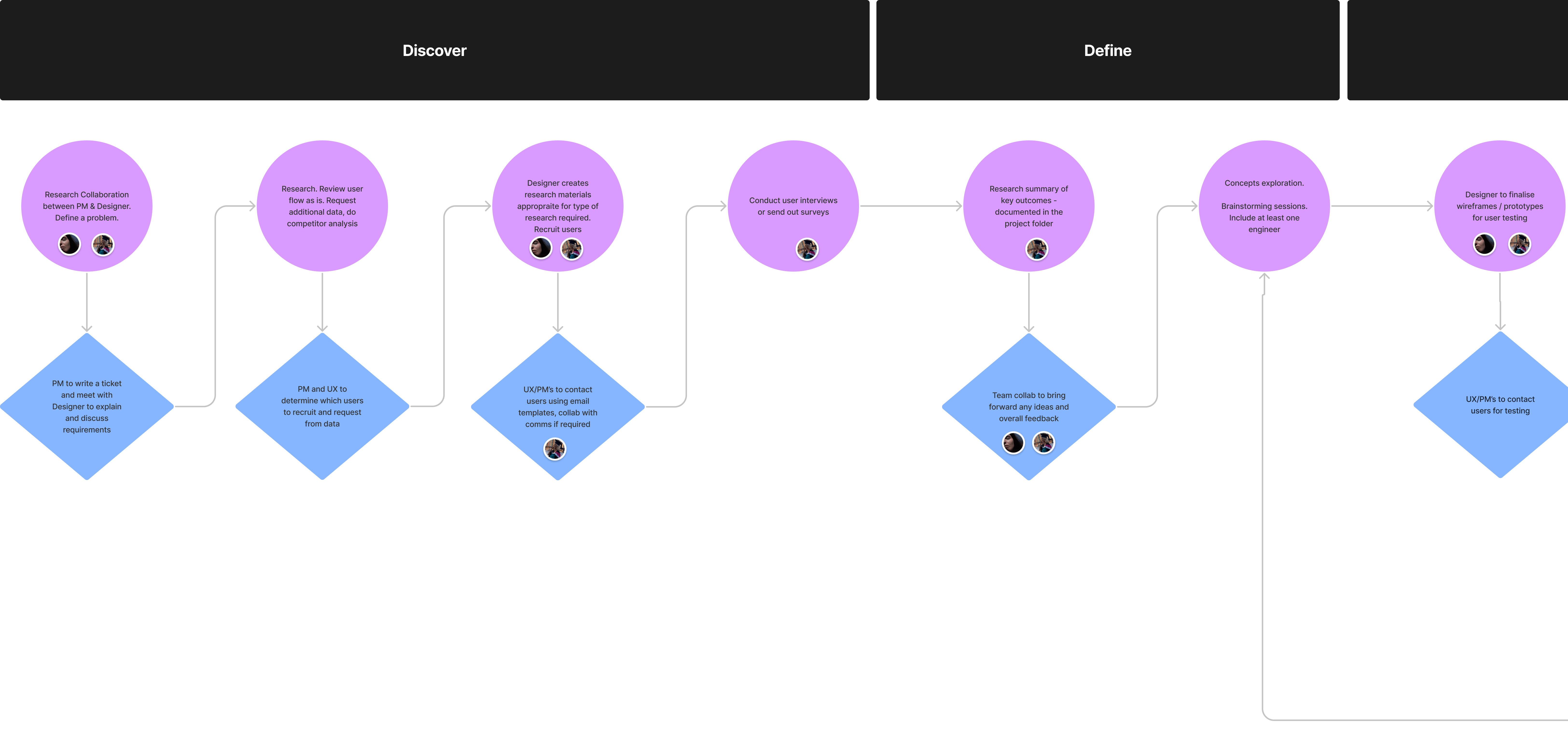
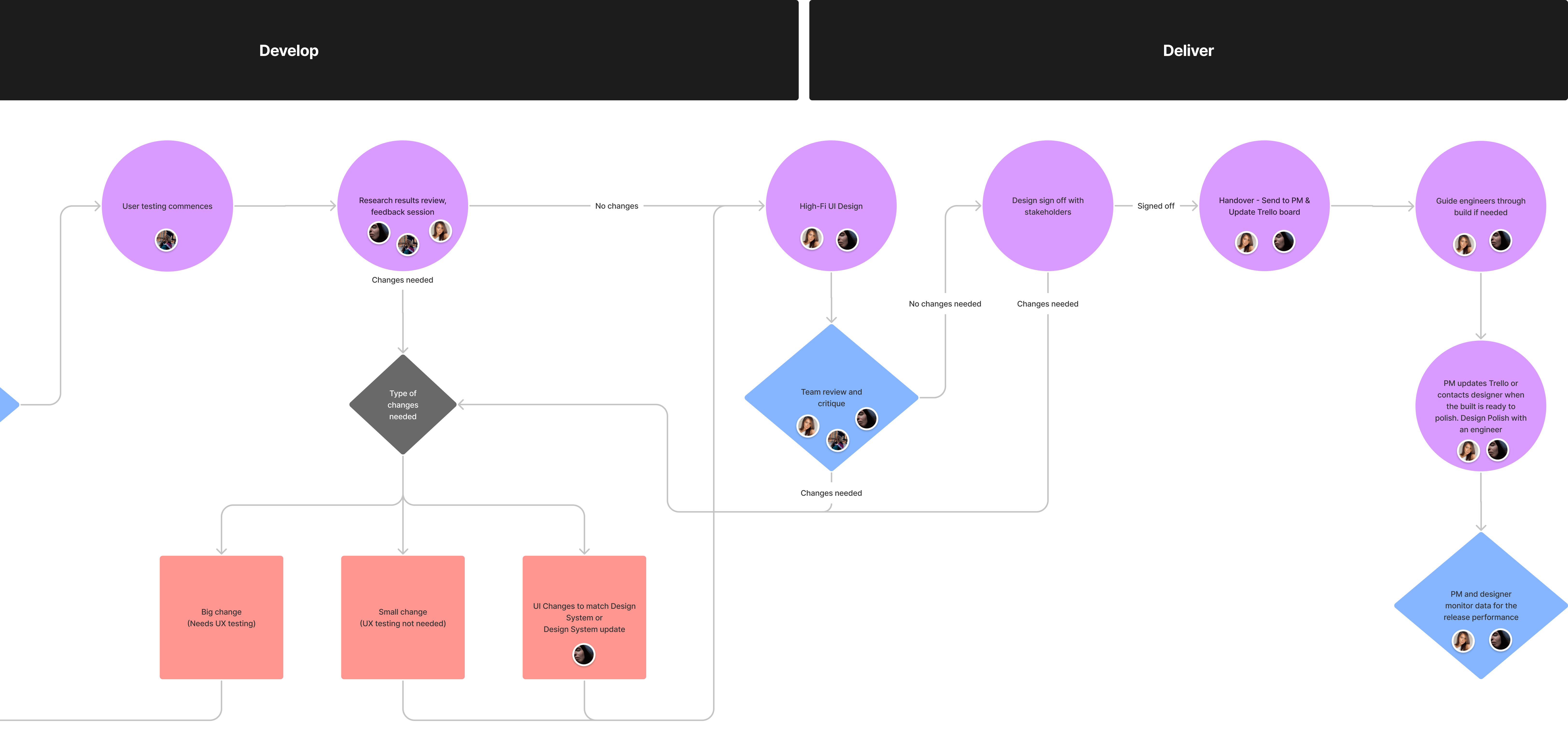
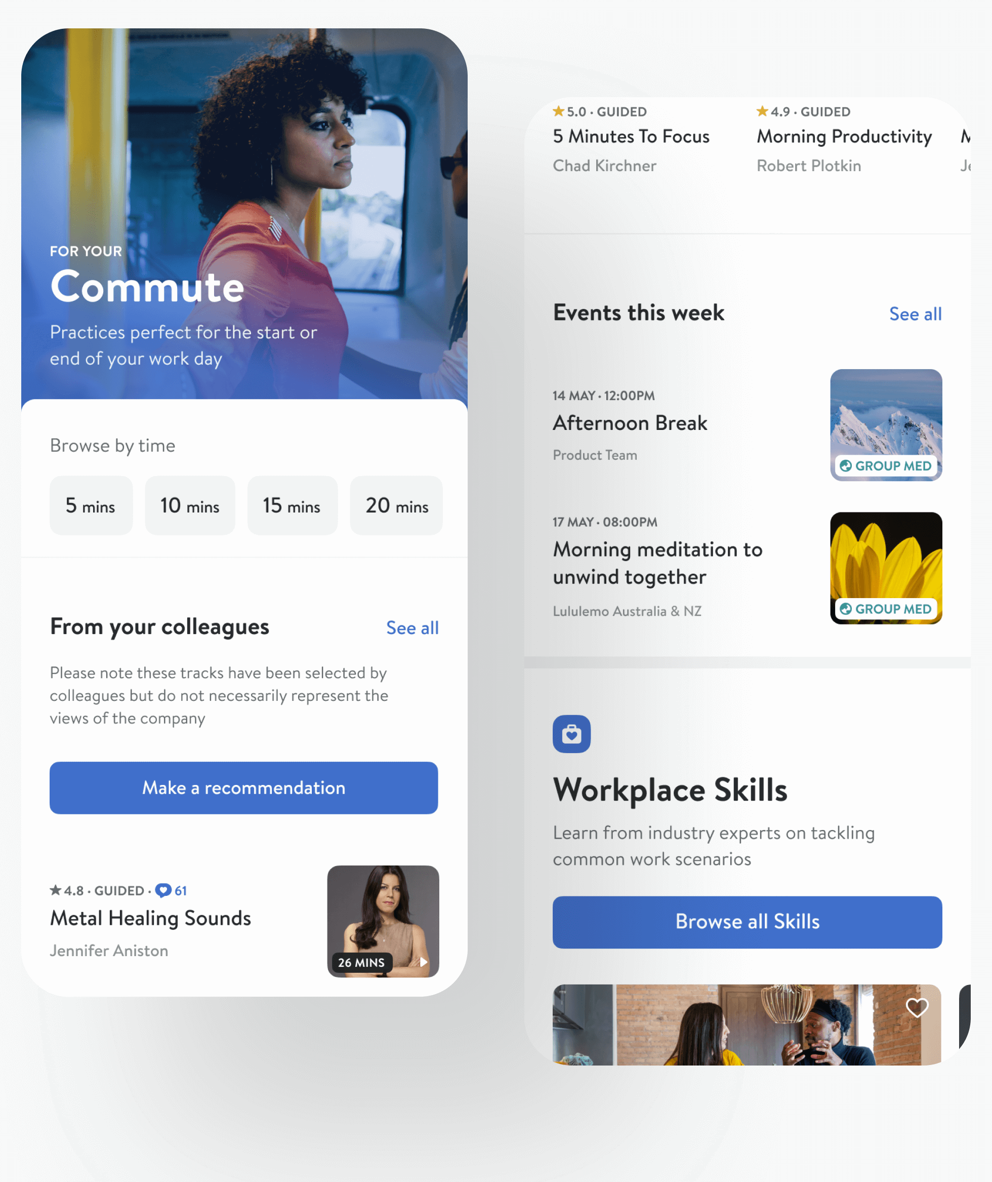
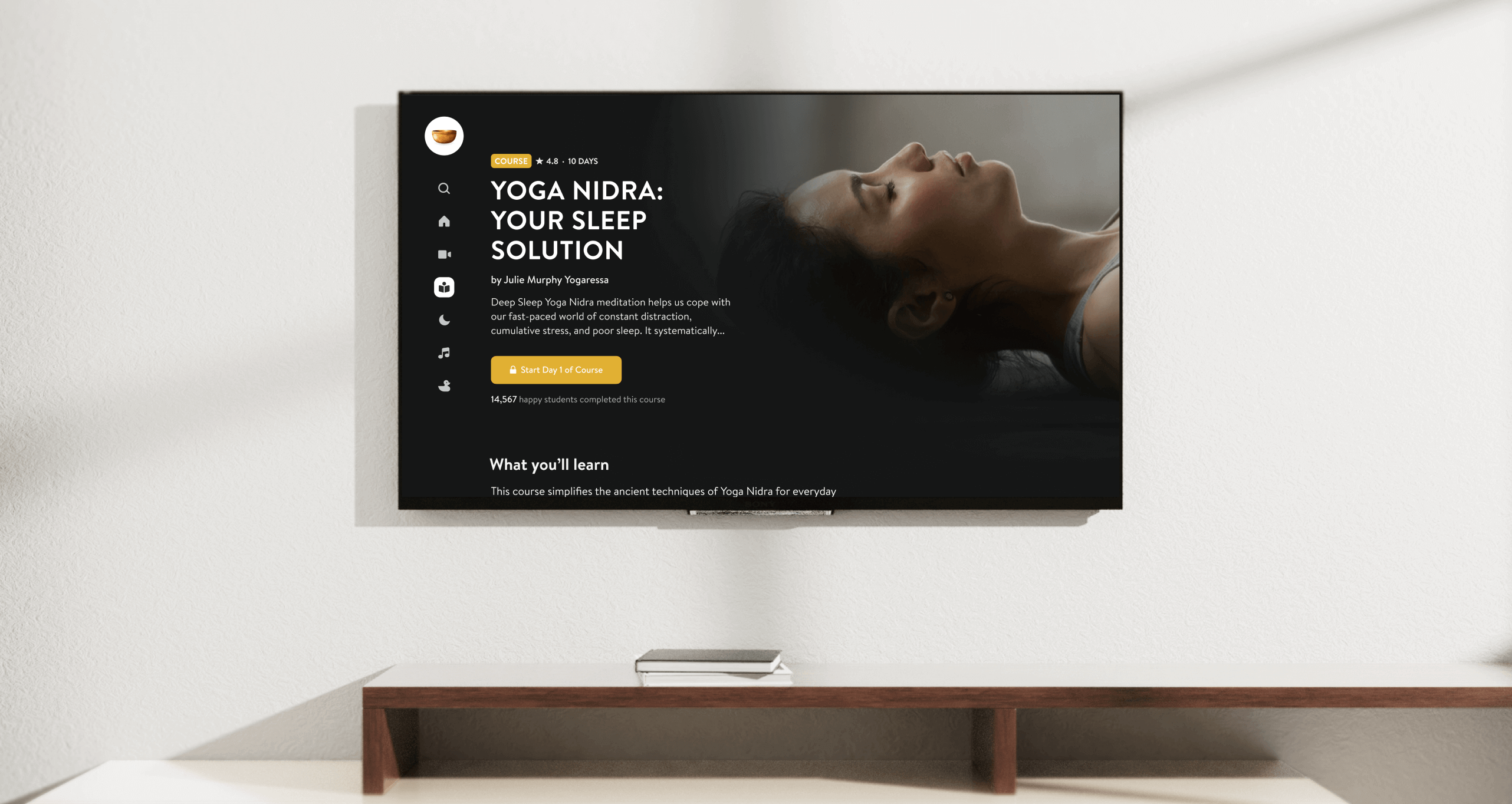
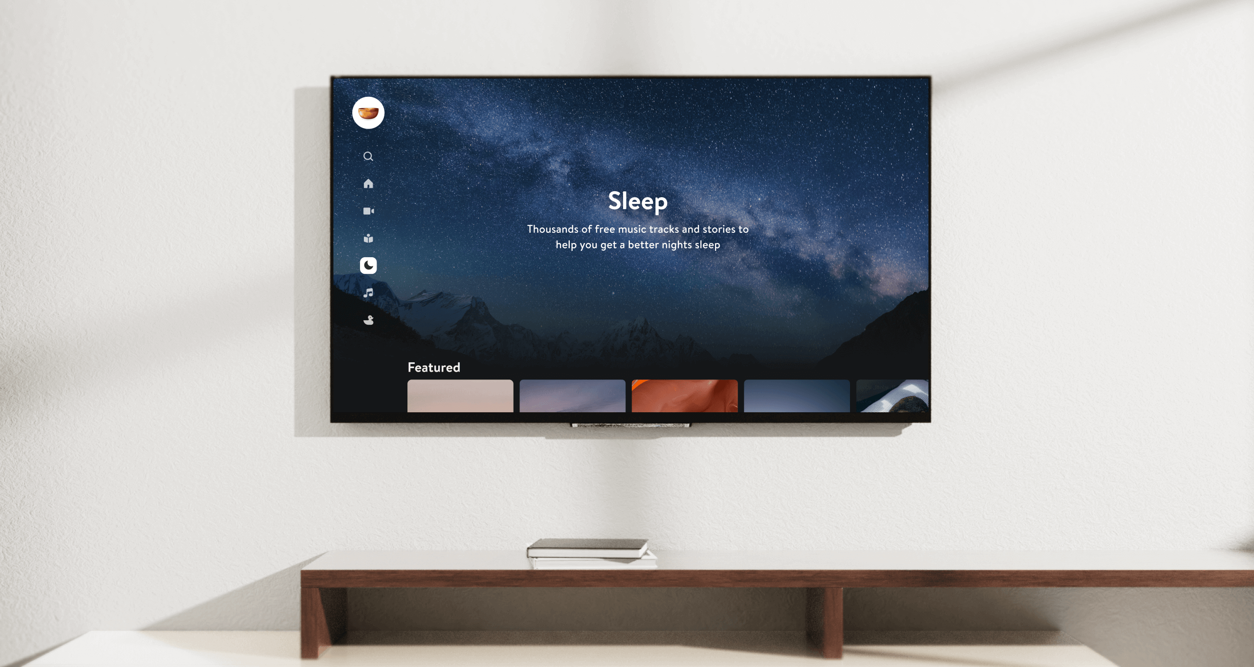
    Over time, as the product matured and the team grew, we incorporated a more comprehensive design process (our documented process is in the image below). It's not fixed and is constantly adapted to specific project specifics. One designer owned the project from start to finish.

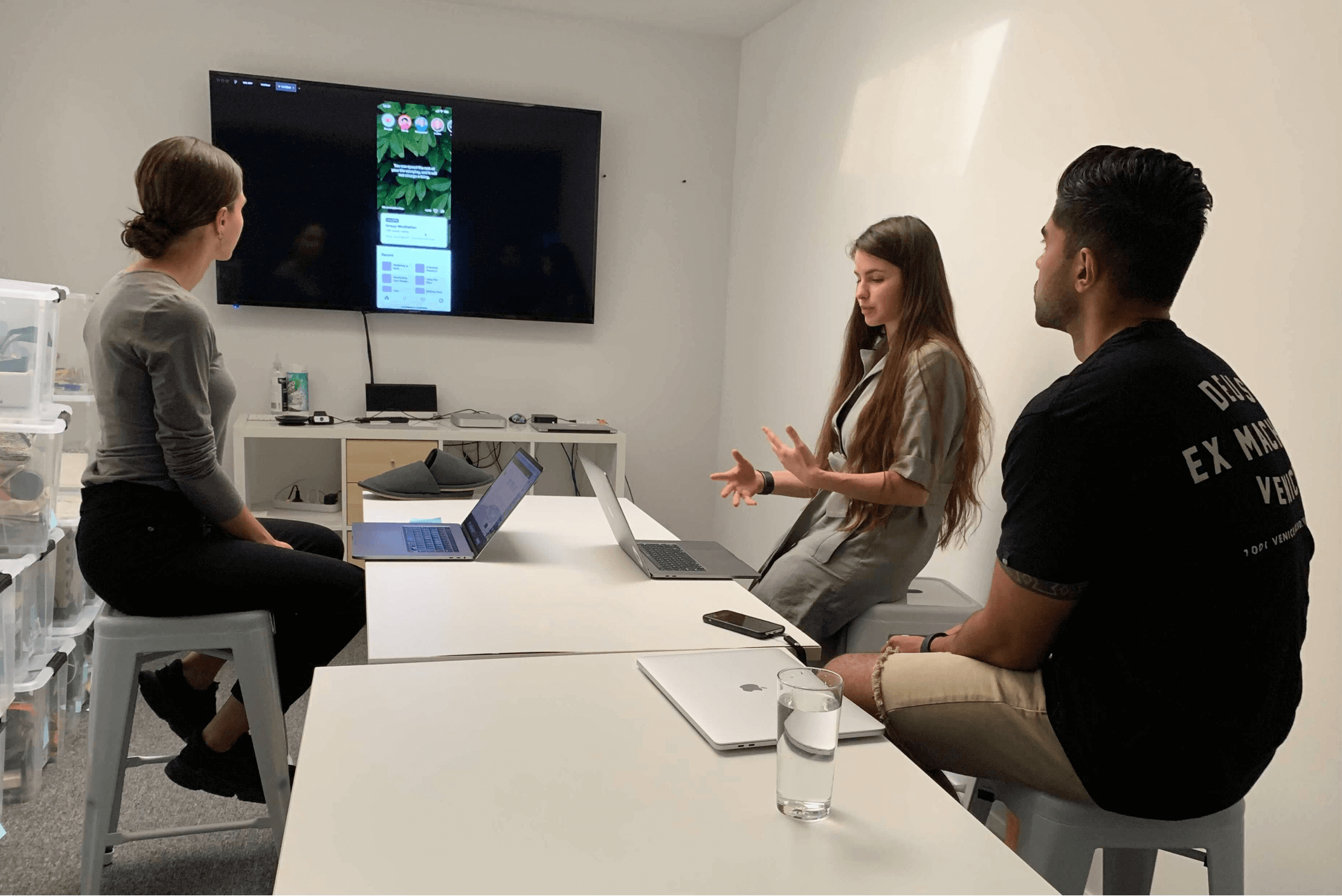
    I always started with a problem, dug into data, talked to users, did competitor research, analysed it all, and had brainstorming sessions to develop solutions. Early collaboration with engineers was vital, so I knew solutions were feasible for the app infrastructure.

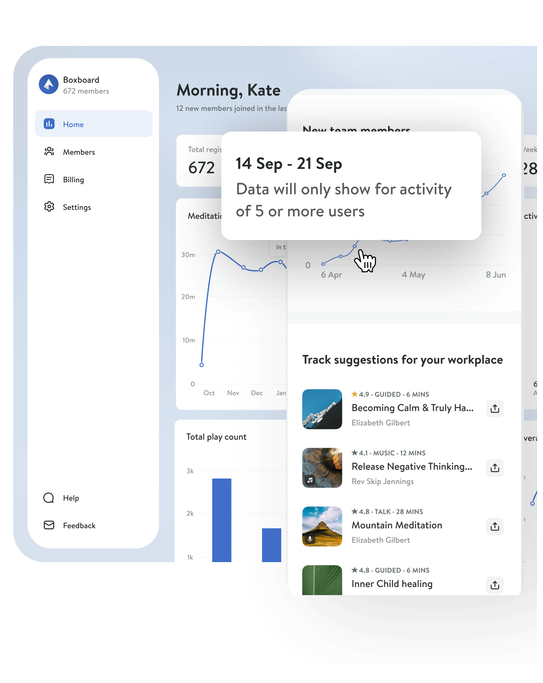
    Design team used Trello for project tracking, Miro or FigJam for workshops and brainstorming sessions, Maze or Typeform for user testing, and Slack for communication.

    Products we’ve built

    I was spread thin between many projects, leading and building new products or iterating and refining already launched ones. Projects varied in scale and covered all mediums from mobile to Smart TVs.

    Design System

    Background & Problem

    It might be counterintuitive to build a design system in a company where you can count the design team on one hand. Still, the complexity of the product has been significantly growing, and inefficiencies have grown alongside. By introducing more consistency, we removed the constant headache of making design changes and freed up time to solve problems more significant than deciding which variant of a content card we should use.

    Our design system isn't comprehensive, but we found a balance between standardising design rules and overrestricting them for the efficiency of design and engineering teams.

    Highlights

  • 70% of all mobile elements are unified.
  • 50% of all web elements are unified.
  • I created scaling rules from a mobile app to large screens.
  • I created rules for transition from light to dark theme.
  • DESIGN SYSTEM

    Fundamentals

    We started with the foundation of a shared set of principles: grid, typography, colour system and iconography to cover most mobile elements. I was fully responsible for designing a typography system and part of the core UI elements on mobile. I also extended the colour system and created a clear logic of light to dark mode transition so that it's fully automated and no further resources would be spent on that later on.

    DESIGN SYSTEM

    Scaling to Web App

    One of my most significant achievements was scaling our mobile app to all screen sizes, from small tablets to large monitors. Our future vision is to be able to create a design, and it would work on any device with one built. I worked solely on this two-month project, and it involved research, a lot of iterations, testing, and a constant touch-base with developers.

    Insight Timer
    for workplaces

    Background & Problem

    The COVID-19 crisis has sparked a revolution in how companies approach mental health in the workplace. Mental health became everybody's business. We tested the market demand for a corporate mental wellbeing product by opening a waitlist and got over 4k companies signing in.

    Solution

    We built an accessible tool for companies that would provide employees with resources to cope with mental health problems through meditation and sleep. We also partnered with experts to create research-based lessons to deal with common workplace scenarios.

    Highlights

  • The first proof of concept didn't pass the market validation stage.
  • Beta Testing before public release.
  • Public launch in August 2021.
  • One of the core drivers of DAU (Daily Active Users) growth in Autumn 2022.
  • I led mobile and web design end-to end.
  • FOR WORKPLACES

    Verified secured onboarding

    We use secure email verification to onboard members to their teams to ensure all the data is protected and user privacy is maintained. We also allow only verified work email domains to join a dedicated workplace.

    FOR WORKPLACES

    Most workplace users
    prefer individual journeys
    over group activities

    Insight Timer is known for its community, but everyone's journey on our app is different. Despite being a product for teams, the workplace product does not force anyone into socialising. For many, daily wellbeing and meditation is a solo journey, and the majority would prefer to keep it like that. With that in mind, all workplace users are welcome to practice independently.

    We also kept the most loved social features for an enhanced connection: group meditations and team recommendations. Each workplace also gets shared stats, meaning each team member contributes to the workplace's total meditation minutes - one of the most loved features.

    FOR WORKPLACES

    Web dashboard for
    Admins & Privacy

    All users' data is private and never shared with anyone - it's at the core of our values, and we stand by it. We never disclose personally identifiable data about our users, and workplace admins only get information in aggregate.

    Live Events

    Like Instagram, Insight Live events are interactive and created to build closer relationships between meditation students and teachers. Still, unlike Instagram, they are all about wellbeing and mindfulness and are free from ads and distractions. In just three months, we grew from 8 to 1,000 events per week and expanded it to yoga teachers.

    For the first launch, I worked solely on the end-to-end Live events experience for web and tablets. I was also leading projects (1) to add the Meditation experience to Live events on mobile and web and (2) increase attendance rates.

    Donations make a difference

    Live Events are free and run on a 'pay-what-you-can' model, helping teachers get income from their events. We were also exploring the monetisation of Live recordings, a frequently requested feature since we launched it.

    Creating a private space

    We quickly learnt that this space for a connection could be used in ways that go against the community, so we protected it by adding moderation features and forced login with a verified account. Logged out users can still attend live sessions without using any social features.

    Integration with a calendar

    We found that simple add-to-calendar action is the most effective to boost attendance at Live events and increase engagement with teachers. By adding a quick and effortless way to add events to users' calendars, we improved Live events attendance.

    Group Meditations

    Stuck at home during the pandemic, many were left in need of connection. Community makes Insight Timer stand out from all other apps in the industry - we are proud to have a large and active community of meditators growing together and supporting each other in various Groups for like-minded people.

    To bring closer those who need it most, in Jan 2021, we launched Group Meditations. Anyone can create one and practice in real-time with anyone, anywhere, and anytime. It's inclusive and open for all: it can be public or private, instant or scheduled, guided or not—both on mobile and web.

    I was working solely on the end-to-end Group Meditations experience on web.

    LG TV App

    LG is the second-largest TV manufacturer globally, with an 18.5% market share and 27 million TVs sold in 2021. LG and Insight Timer started a partnership in 2022 so that the Insight Timer TV app would be pre-installed on all new Smart TVs.

    The goal was to build a TV app that would be a joy to use and drive mobile app installs and daily active user growth. We kept the design clean and reduced it to the simplest possible components. The app allows you to listen to a library of 10,000+ tracks, search, browse, filter content based on topics and duration, and watch Insight Timer Live events right on the TV! (Live yoga class, anyone?).

    We built it in just under three months and launched it in May 2022. The Head of Design and myself collaborated on the Discovery phase, and I worked solely on the rest of the designs until launch and supported the project post-launch.

    x

    iOS 14+ widgets and clips

    The iOS 14 changes made a way to make your app stand out on the home screens. First movers get the biggest market share and get higher chances to increase engagement, daily usage and retention, so we aimed to release them together with the iOS 14 launch (and we did!). Not many apps had their widgets ready by the iOS 14 launch, which made us stand out and led to the reactivation of previously stagnant users.

    Our widgets give users an overview of their recent tracks played, update users on upcoming Live events, and show their meditation stats in the largest widgets sizes. We made sure the widgets are dynamic, change according to what's most actual for users at the moment and always navigate to the relevant page in the app once opened.

    As Human Interface Guidelines recommend, we also reflected the Insight Timer brand within widgets, primarily with our font and colours.

    I solely designed app widgets and clips.

    Learnings

    1. Prioritise ruthlessly and get things out fast

    To get things out sooner and get fast feedback, boil things down to the bare essentials and perfect saying no to out-of-scope requests. Avoid the waterfall process and get products out sooner so you don't spend valuable time on things that users don't need.

    2. Seek out feedback early and continually

    Keep stakeholders and users in the loop to save time and re-work as early as possible.

    3. AB test as much as you can

    You can't know the effects of your designs unless you AB test them. Without it, you can push things into production, but you'll never know if the design caused the change or something else. There are always external factors you can't count for.

    4. Talk to users, but know that their words don't necessarily translate into actions

    People often mistakenly predict what they would do and buy. Real-life behaviours differ from what people say during interviews and testing sessions.

    Startups often rely on a vision and are short on time and resources for in-depth research, but you must always validate your ideas with the end-users.

    5. Simplicity is a strength

    As the complexity of the product grows, the first instinct is to introduce new styles and new elements and overengineer things. Don't. Users won't understand any complex logic in overly-curated systems. Unify and remove everything that can be removed - this is what makes the design nearly seamless and sophisticated.

    This doesn't
    have to end yet,
    you know!

    Email me at katetrifo@proton.me
    and let's talk about anything

    See more work

    Creating an alaytics tool to scale chatbot to 100,000 customers

    Rebuilding an app for the largest bank in Estonia